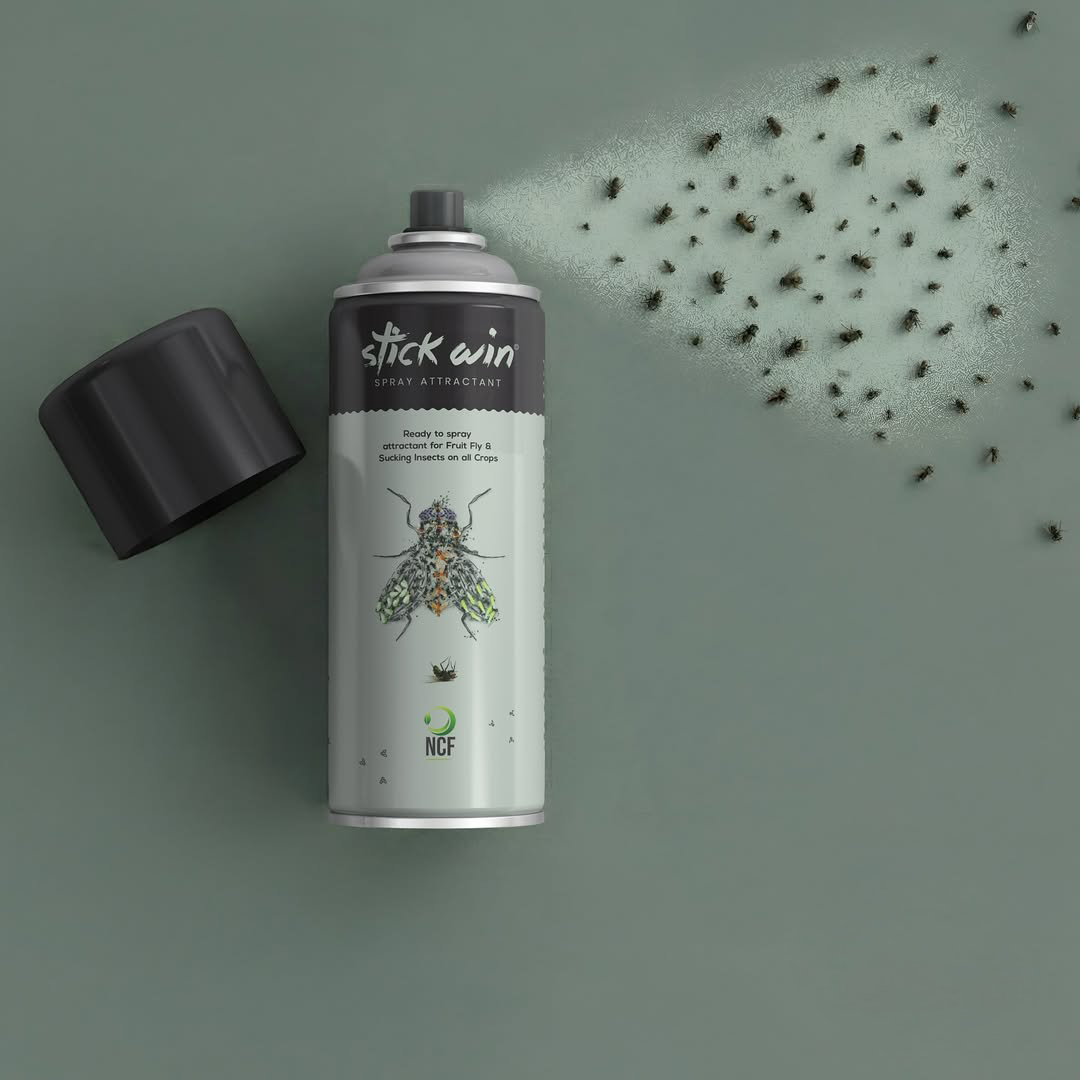
Stick Win Spray Attractant
Packaging Design Case Study
Overview
Stick Win is a ready-to-spray attractant developed for controlling fruit flies and sucking insects across various crops. The challenge was to create a packaging identity that instantly communicates its purpose while standing apart from the highly cluttered agricultural chemical market, where most products rely on aggressive colors, complex graphics, and information-heavy layouts.
Our objective was to design a package that feels scientific, premium, and memorable, while ensuring farmers can quickly understand the product's function.
The Challenge
Agricultural spray products often follow a predictable visual language:
- Bright red, yellow, and green color schemes
- Overloaded technical information
- Generic insect photographs
- Similar-looking competitor packaging
As a result, products struggle to create a distinct shelf presence and brand recall.
The challenge for Stick Win was to:
- Build a unique visual identity
- Communicate insect attraction and control effectively
- Establish trust through a clean and professional appearance
- Improve product visibility and recognition in retail environments
Our Design Approach
1. Minimalism in a Crowded Category
Instead of competing with visual noise, we intentionally reduced it.
A clean white base creates a strong contrast against typical agrochemical packaging and immediately draws attention. The uncluttered layout gives the product a premium and scientific appearance, helping it stand out from competing products.
2. Hero Visual That Tells the Story
The centerpiece of the design is the highly detailed insect illustration.
Rather than using a standard stock image, the insect becomes the visual hero of the package. This instantly communicates the product's target application while creating a stronger emotional and visual connection.
The illustration serves as both:
- A functional communication tool
- A memorable brand asset
3. Premium Black & White Contrast
The upper black section paired with the clean white body creates a sophisticated and professional look.
This contrast:
- Improves readability
- Creates stronger shelf impact
- Enhances product credibility
- Differentiates the brand from colorful competitors
The design feels closer to a modern scientific product than a conventional pesticide pack.
4. Handcrafted Brand Expression
The "Stick Win" logotype uses a hand-drawn brush-style treatment that introduces personality into an otherwise technical category.
This balance between:
- Scientific precision
- Human-centered design
helps create a brand that feels both trustworthy and approachable.
5. Clear Product Communication
Information hierarchy was carefully planned to ensure users can understand the product quickly.
The packaging clearly communicates:
- Product type (Spray Attractant)
- Application method (Ready to Spray)
- Target insects (Fruit Fly & Sucking Insects)
- Brand identity
Without overwhelming the user with excessive visual elements.
The Result
The final Stick Win packaging successfully breaks category conventions through a clean, premium, and highly focused design system.
Key Outcomes
- Strong shelf differentiation
- Modern scientific appearance
- Improved product recognition
- Clear communication of product purpose
- Premium brand perception
- Memorable visual identity
Conclusion
The Stick Win packaging demonstrates how thoughtful design can transform an everyday agricultural product into a distinctive brand experience. By replacing visual clutter with clarity, and generic imagery with meaningful storytelling, the package creates a stronger connection with users while establishing a unique presence in the market.
At Curve Designs, we believe effective packaging isn't just about looking different—it's about communicating better, building trust, and creating lasting brand recall.