One Square Associates — Logo Case Study
A simple idea. Multiple meanings. One strong identity.
Overview
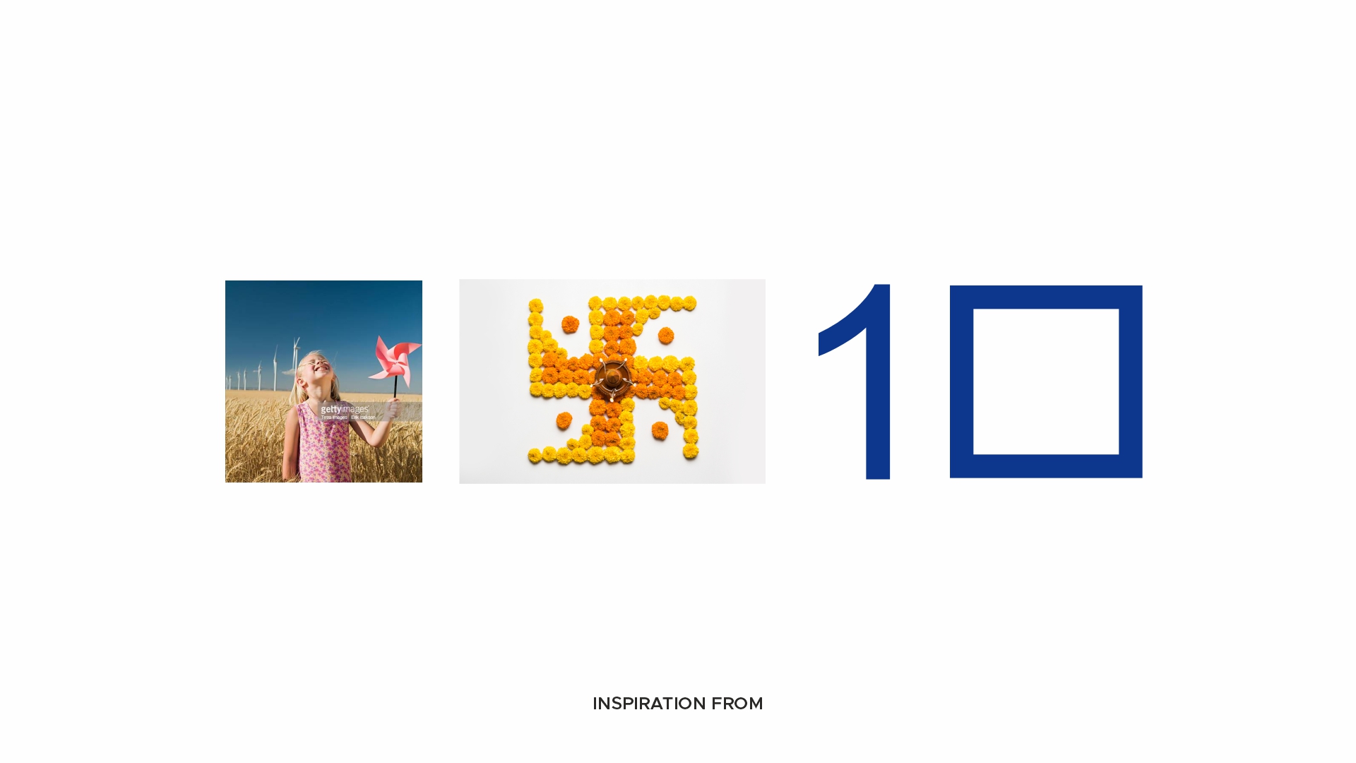
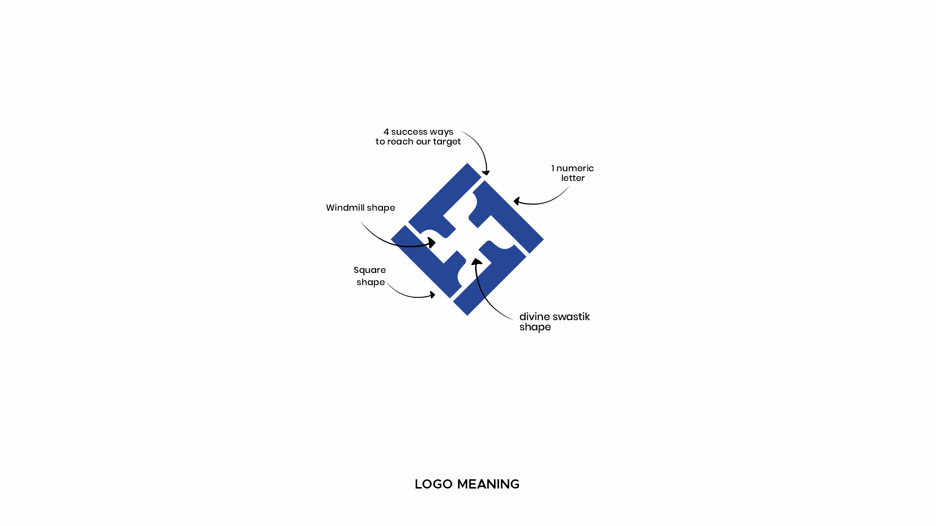
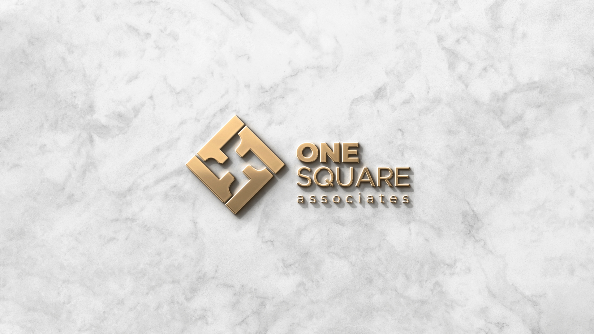
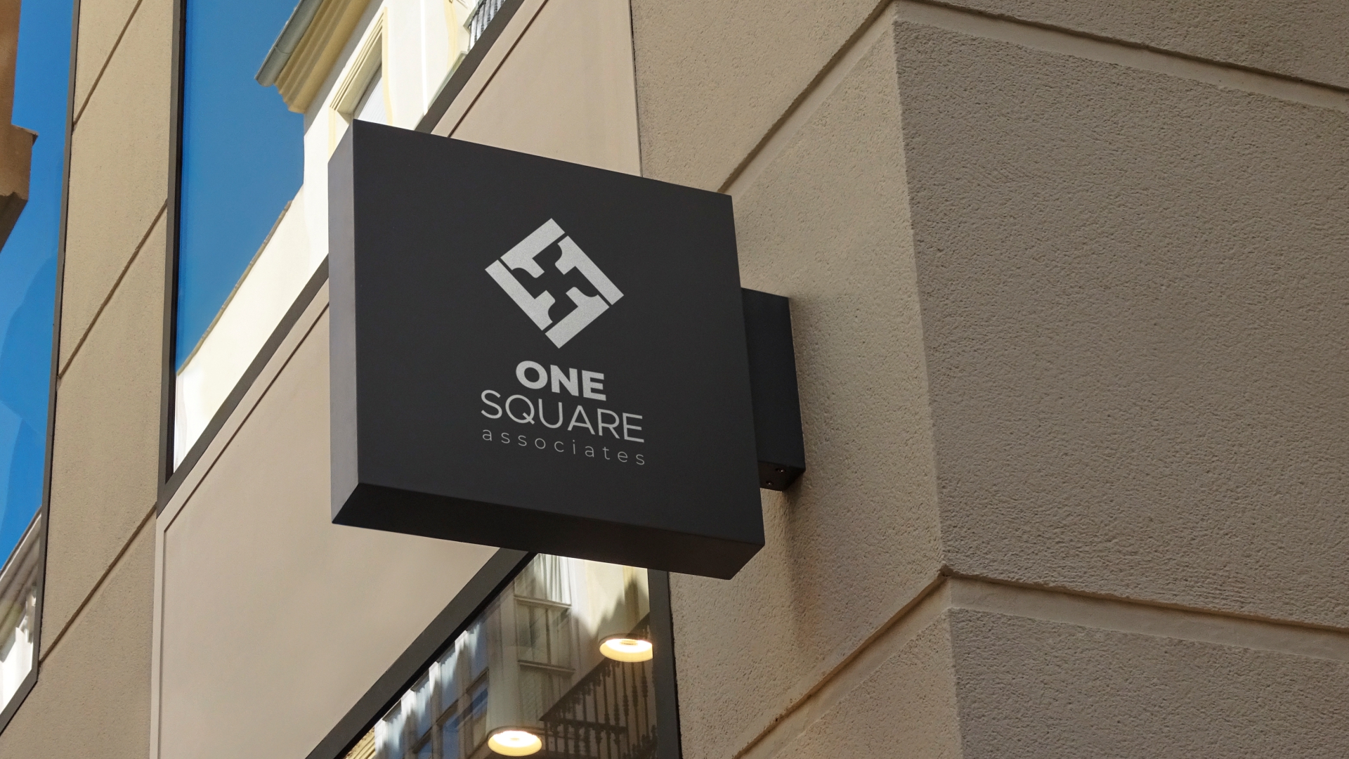
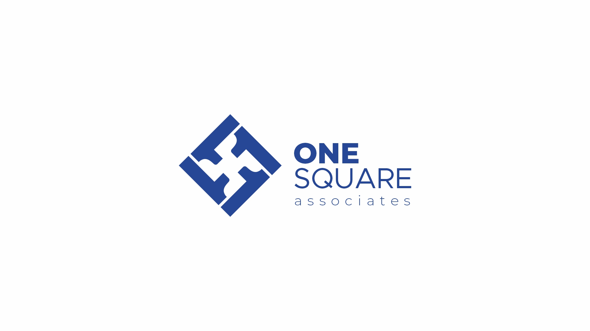
The challenge was to create a logo that feels modern, professional, and meaningful without relying on complex graphics. The final mark is built from the number “1”, representing leadership, vision, and a single focused direction.
The form is enclosed within a square, symbolizing stability, structure, trust, and strong foundations—qualities essential in any successful business relationship.
On closer observation, the symbol subtly reveals a windmill-inspired shape, representing movement, growth, energy, and progress. At its center, the geometry naturally forms a swastik-inspired pattern, a timeless symbol of positivity, prosperity, and auspicious beginnings.
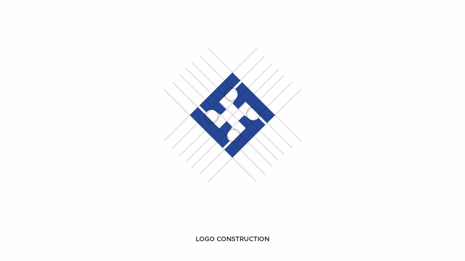
What makes this logo unique is its simplicity. With just a few geometric forms, it communicates multiple layers of meaning while remaining clean, memorable, and instantly recognizable. It proves that effective branding is not about adding more elements—it is about expressing more with less.
One symbol. One vision. One Square.