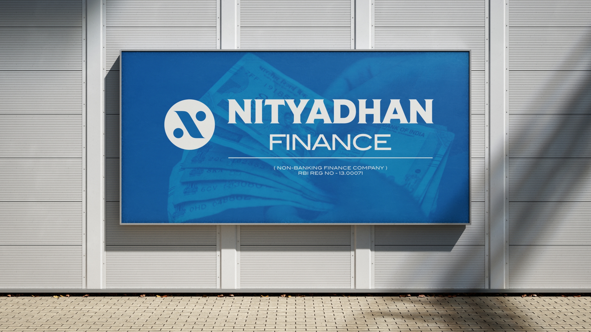
Nityadhan Finance
Brand Identity & Logo Design Case Study
Overview
Nityadhan Finance is a Non-Banking Financial Company (NBFC) focused on building long-term financial relationships through trust, transparency, and sustainable growth. The challenge was to create a distinctive identity that could stand confidently among established finance brands while communicating reliability, customer-centricity, and financial progress.
The objective was to design a logo that feels professional, modern, memorable, and meaningful without relying on generic finance symbols such as currency icons, graphs, or buildings.

Industry Research
India's NBFC sector is one of the fastest-growing segments in the financial services industry. Industry reports indicate that NBFC assets under management have crossed ₹50 lakh crore and are projected to continue growing strongly over the coming years. The sector serves millions of customers across retail lending, SME finance, vehicle finance, and wealth management.
Key Competitor Brands
- Bajaj Finance
- Tata Capital
- Shriram Finance
- Muthoot Finance
- Cholamandalam Investment & Finance
- Mahindra Finance
These brands are known for trust, accessibility, financial inclusion, and large customer networks. The Nityadhan identity needed to feel equally credible while establishing its own visual personality.
Design Strategy
Rather than creating a logo around a common finance symbol, the identity was built from multiple conceptual elements that together represent the company's core values.
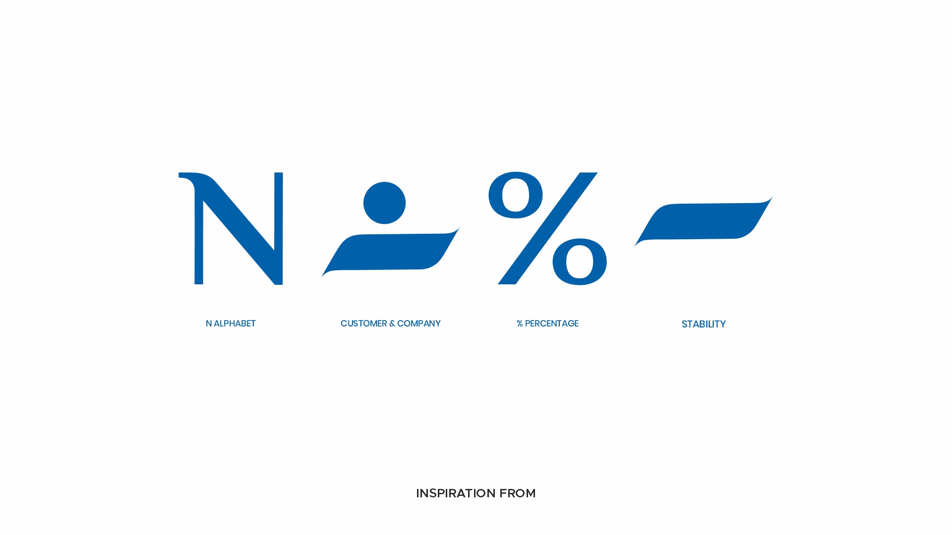
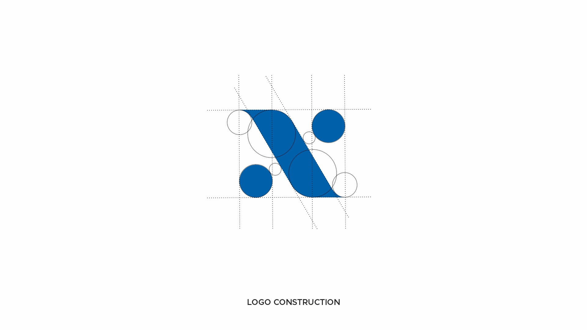
Logo Construction
N – Nityadhan
The primary structure originates from the letter "N", creating a direct and memorable connection with the brand name.
Customer & Company
The two circular elements represent the relationship between the customer and the company. They symbolize partnership, trust, and mutual growth.
Percentage Symbol (%)
The diagonal structure references the percentage sign, a universal symbol associated with finance, investment, returns, and wealth creation.
Stability
The extended horizontal forms create a strong visual foundation, representing stability, consistency, and long-term financial security.
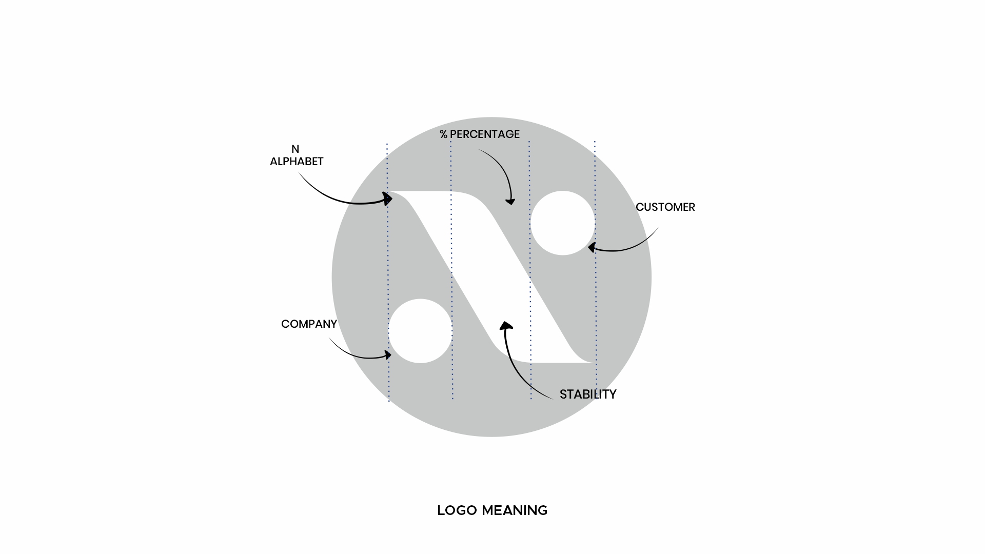
The Meaning Behind the Symbol
At its core, the logo communicates:
Customer + Company + Financial Growth + Stability
The mark visually conveys that Nityadhan Finance acts as a bridge between customers and financial opportunities while maintaining a strong foundation of trust and security.
Visual Identity
Color Choice
Blue was selected as the primary brand color because it is globally associated with trust, professionalism, security, reliability, and financial confidence.
Typography
The typography combines a premium serif style for authority and heritage with a modern sans-serif style for accessibility and contemporary appeal.
Why This Logo Works
- Instantly connected to the brand name through the letter "N"
- Incorporates finance symbolism without becoming generic
- Represents customer-company relationships
- Communicates stability and growth
- Simple and memorable structure
- Highly scalable across digital and print applications
- Creates strong differentiation from competitor finance brands
Conclusion
The Nityadhan Finance identity demonstrates how a simple symbol can communicate multiple business values simultaneously. By combining the N alphabet, customer relationship, percentage sign, and stability, the logo transforms into a meaningful visual system that reflects the company's mission of creating sustainable financial growth.
The result is a modern NBFC brand identity that is professional, distinctive, and built to inspire confidence for years to come.