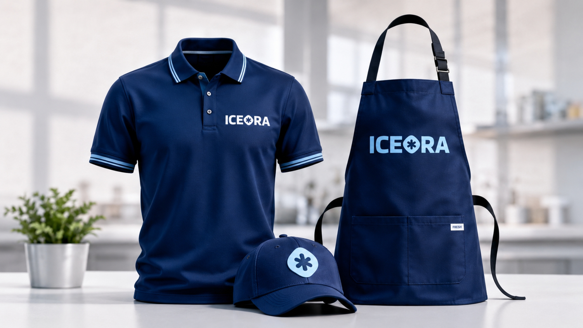
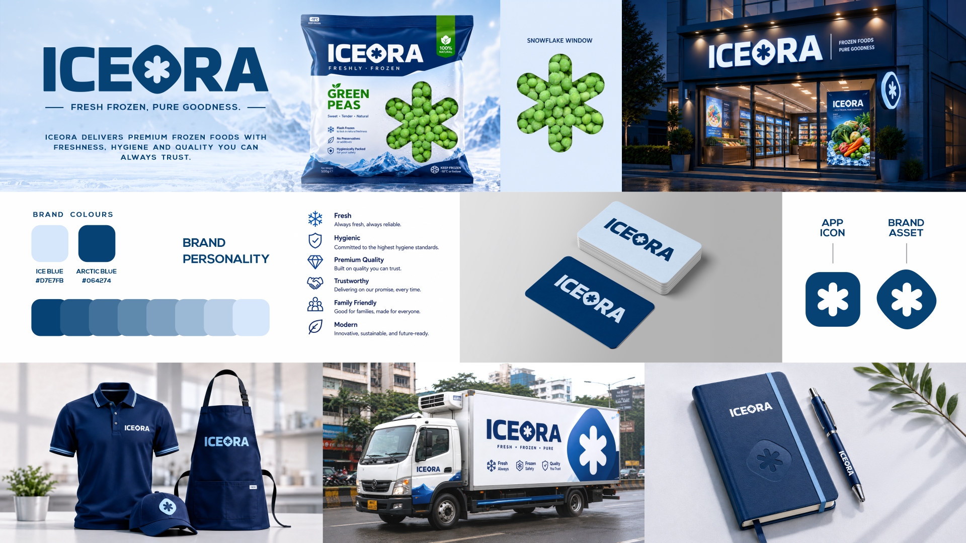
ICEORA Frozen Green Peas Packaging Design
Case Study: Designing for Freezer Visibility, Product Trust & Premium Shelf Impact
Overview
The packaging design for ICEORA Frozen Green Peas was developed with a single objective: to create a highly recognizable frozen food pack that performs effectively inside crowded freezer environments while communicating freshness, quality, and trust at first glance.
Unlike conventional retail packaging, frozen food products face a unique challenge. They are displayed inside freezer cabinets where visibility is limited, multiple packs are stacked together, and consumers typically spend only a few seconds making purchase decisions. The design strategy therefore focused on maximizing brand recognition, improving product identification, and creating a premium frozen-food experience.
The Challenge
Most frozen vegetable brands compete in visually crowded freezer sections where:
- Only a portion of the pack is often visible.
- Frost and freezer lighting reduce readability.
- Consumers rely on quick visual cues.
- Similar products create confusion and reduce differentiation.
The challenge was to design a packaging system that could:
- Stand out inside freezer cabinets.
- Be instantly recognizable even when partially visible.
- Clearly communicate the frozen nature of the product.
- Build trust through transparency and authenticity.
- Maintain a premium yet functional appearance.
Design Strategy
1. Freezer-First Visibility Approach
Rather than designing primarily for traditional retail shelves, the packaging was developed specifically for freezer environments.
Research showed that consumers often see only a small portion of a frozen pack because products are stacked tightly together. To address this, the ICEORA brand identity was treated as the primary visual element.
The oversized vertical wordmark ensures that even when only part of the pack is visible, consumers can immediately identify the brand.
Design Goal: Maximize brand recognition from a distance and within crowded freezer displays.
2. Vertical Brand Architecture
The ICEORA logo was intentionally placed in a bold vertical orientation along the pack.
This approach serves multiple purposes:
- Increases visibility when packs are arranged side-by-side.
- Creates a unique shelf presence compared to conventional horizontal layouts.
- Allows the brand to remain identifiable even when the top section is covered.
The vertical branding becomes a distinctive visual signature for the product line and improves recall during repeat purchases.
3. Cold-Chain Visual Language
The entire colour palette was built around the psychology of frozen products.
Different shades of blue were selected to represent:
- Freshness
- Cold storage
- Frozen preservation
- Product purity
Blue naturally reinforces the perception of low temperatures and helps consumers instantly associate the product with a frozen category.
The contrast between the cool blue background and vibrant green peas further enhances product visibility and appetite appeal.
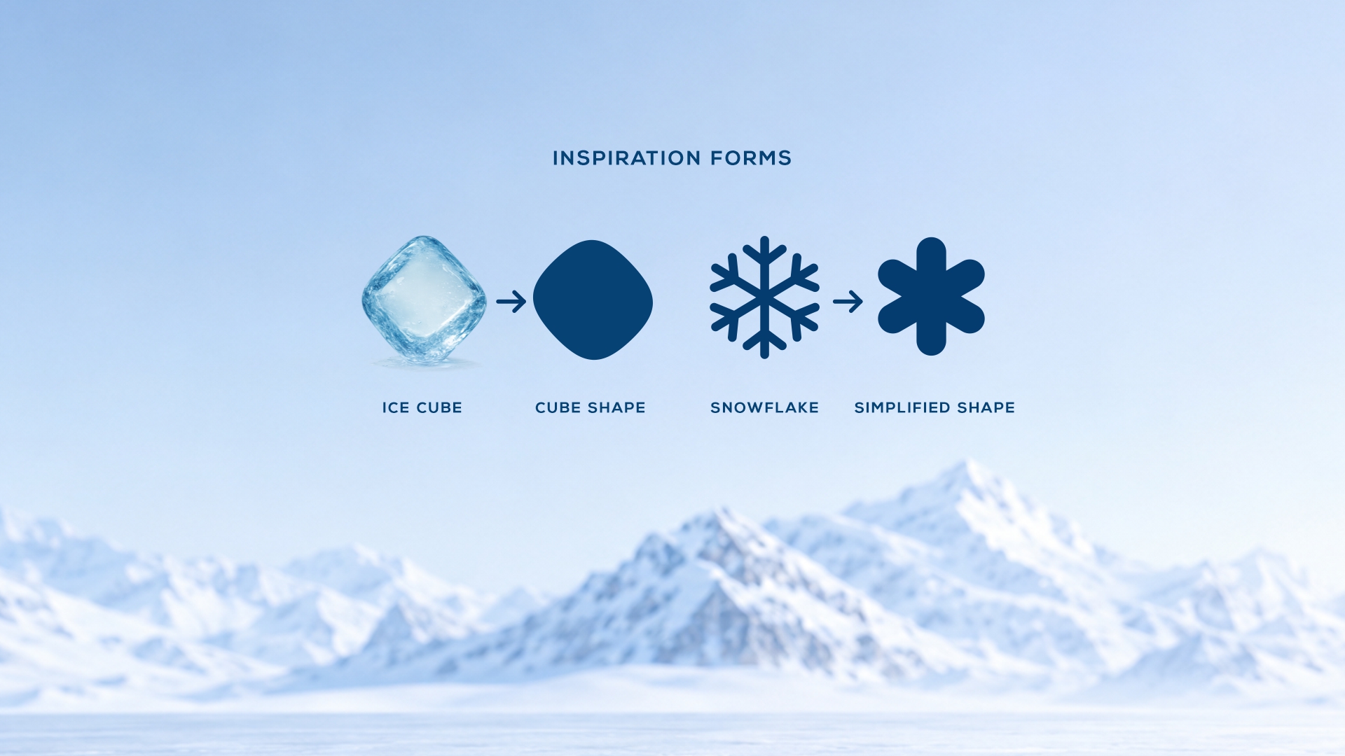
4. Product Recognition Through Transparency
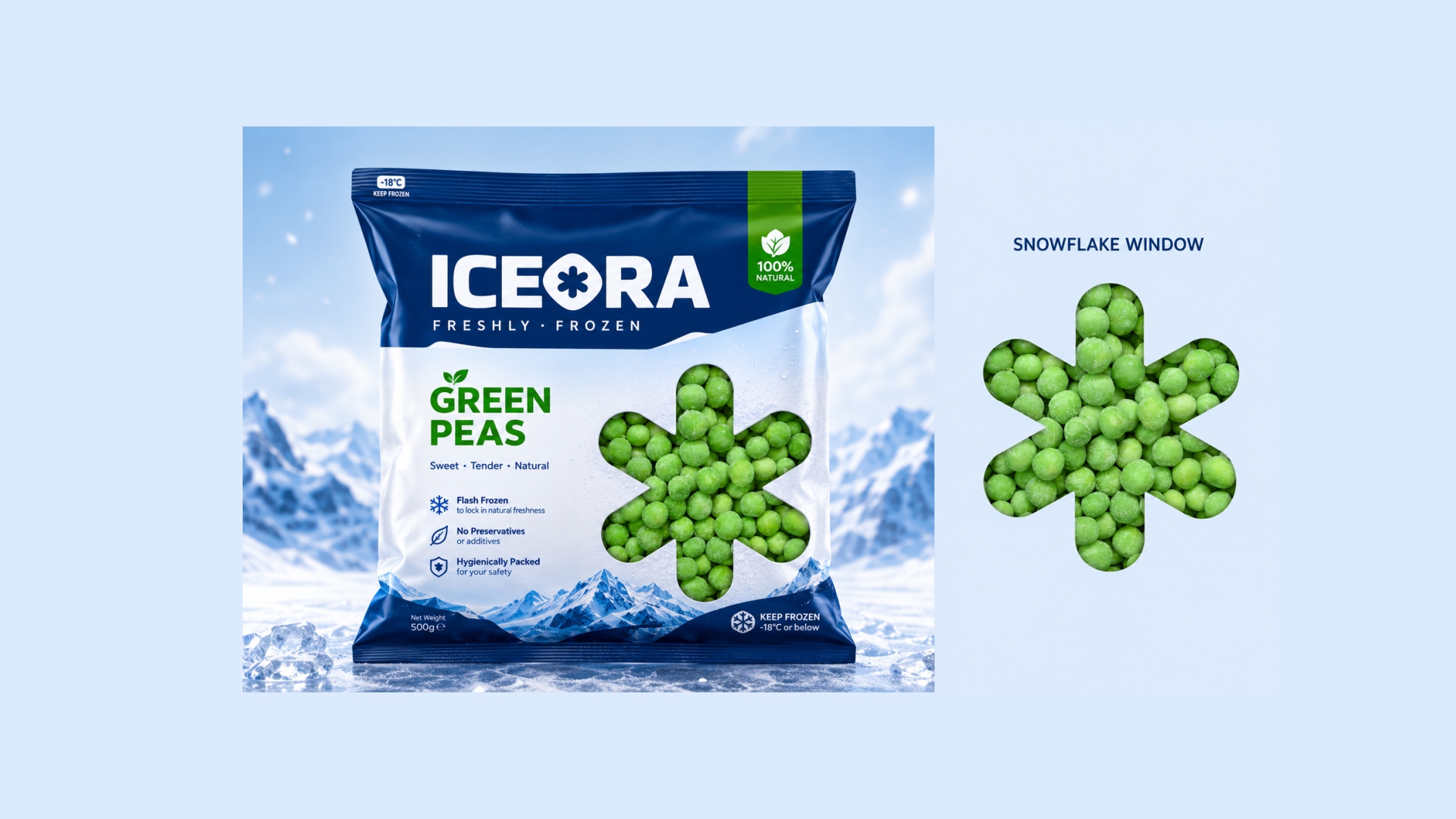
One of the key design decisions was the creation of a flower-shaped transparent window that reveals the actual frozen peas inside the package.
This feature was introduced to increase consumer confidence by allowing shoppers to see the product rather than relying solely on photography or illustrations.
The transparent window:
- Demonstrates product authenticity.
- Enhances trust and credibility.
- Reduces dependence on artificial product imagery.
- Creates a stronger connection between packaging and product.
The flower shape also subtly reinforces freshness and natural produce associations.
5. Snow Mountain Graphics
The mountain illustration positioned at the bottom of the pack functions as a symbolic representation of frozen preservation.
These graphics communicate:
- Frozen storage conditions.
- Cold-chain integrity.
- Premium frozen quality.
- Freshness locked through freezing.
Beyond functionality, the illustration adds visual depth and elevates the overall premium appearance of the packaging.
6. Simplified Information Hierarchy
Consumers make frozen food purchasing decisions quickly.
To support rapid decision-making, the front panel was intentionally kept clean and uncluttered.
Only the most important product benefits are highlighted:
- Flash Frozen
- No Preservatives
- Hygienically Packed
This minimalist hierarchy enables consumers to absorb key information within seconds while maintaining a sophisticated premium look.
7. Functional Packaging System
The packaging architecture was designed with both usability and readability in mind.
The front panel focuses on:
- Brand visibility
- Product recognition
- Purchase-driving benefits
The back panel is reserved for:
- Nutritional information
- Product specifications
- Regulatory requirements
- Consumer guidance
This structured information system prevents visual clutter and improves the overall user experience.
Design Outcome
The final ICEORA packaging successfully combines strategic branding, product transparency, and freezer-specific visibility principles into a cohesive design system.
- Strong freezer shelf visibility
- Distinctive vertical brand recognition
- Premium frozen-food positioning
- Enhanced consumer trust through product visibility
- Clear communication of product benefits
- Organized and functional information architecture
Conclusion
The ICEORA Frozen Green Peas packaging was designed with a deep understanding of real-world freezer retail environments. Every element—from the vertical brand identity and transparent product window to the cold-inspired colour palette and mountain graphics—serves a specific strategic purpose.
The result is a packaging solution that not only attracts attention inside crowded freezer cabinets but also communicates freshness, quality, authenticity, and trust, helping consumers make faster and more confident purchasing decisions.