Dr. Saffron – Brand Identity Case Study
Crafting a Premium Skincare Identity Rooted in Elegance & Trust
Overview
Dr. Saffron was envisioned as a modern skincare and personal care brand that balances scientific credibility with natural beauty. The objective was to create a visual identity capable of competing alongside established global beauty brands while maintaining a distinctive and memorable character
The challenge was to develop a logo that would instantly communicate trust, sophistication, wellness, and premium quality—essential qualities within the skincare and cosmetic industry.
The Challenge
In today's beauty market, consumers are surrounded by premium brands that rely heavily on elegant typography, minimalism, and refined visual language. To position Dr. Saffron effectively within this landscape, the identity needed to:
- Build instant trust and credibility
- Reflect luxury and premium quality
- Feel modern yet timeless
- Create a strong connection with the brand name
- Stand confidently among international skincare brands
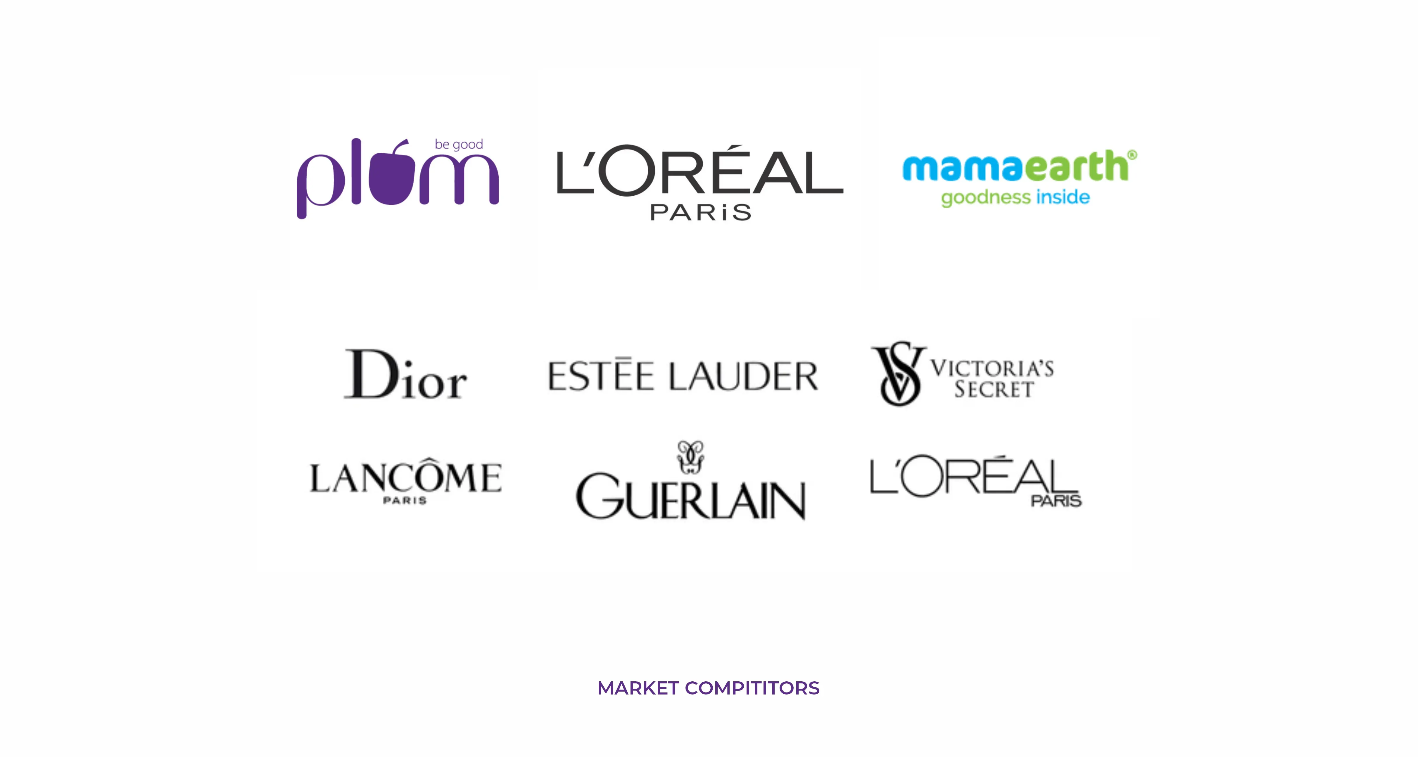
Market Research & Competitive Analysis
Before beginning the design process, a detailed study of leading beauty and skincare brands was conducted, including brands such as Plum, L'Oréal Paris, Dior, Estée Lauder, Lancôme, Guerlain, Victoria's Secret, and Mamaearth.
Key Observations:
- Premium beauty brands often use typography as the primary identity element.
- Simplicity creates stronger brand recall.
- Elegant serif letterforms communicate luxury and heritage.
- Minimal visual systems perform better across packaging and digital applications.
- Distinctive details within typography help create memorable brand assets.
These insights became the foundation of the Dr. Saffron identity system.
Design Strategy
Rather than relying on a separate icon or symbol, the logo was developed as a custom wordmark where the brand name itself becomes the visual identity.
The typography was carefully refined to create a balance between:
- Professionalism
- Luxury
- Approachability
- Femininity
- Wellness
The result is a sophisticated wordmark that feels premium without becoming overly decorative.
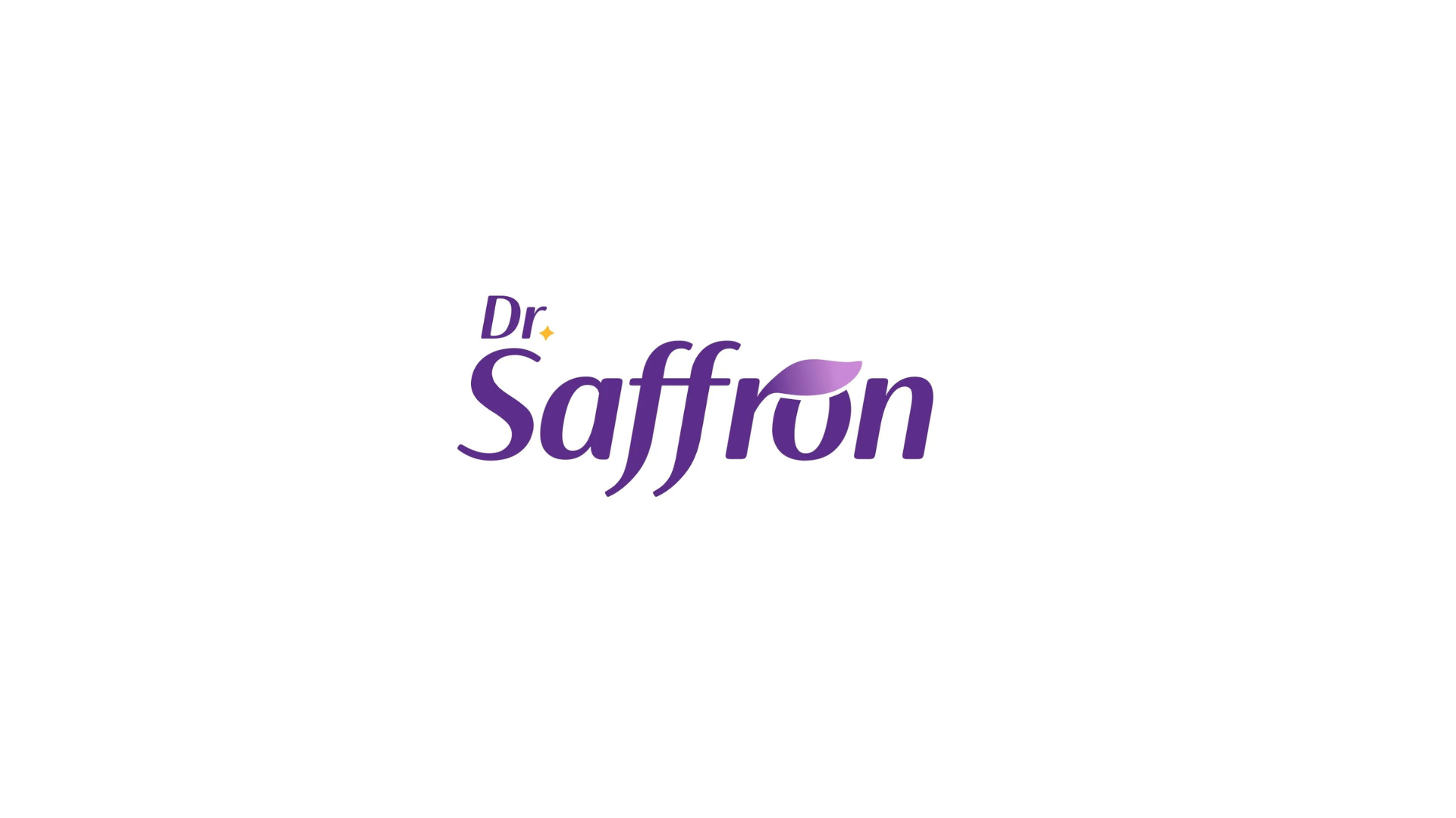
The Saffron Petal Concept
The most distinctive feature of the identity is the integration of a saffron-inspired petal within the letterform.
This element was intentionally embedded into the typography rather than added as an external icon.
Why a Petal?
The petal serves as a visual representation of saffron—an ingredient widely associated with:
- Purity
- Natural care
- Wellness
- Luxury
- Beauty
By integrating this shape directly into the logo, the brand creates a meaningful connection between its name and visual identity while maintaining a clean and premium aesthetic.
This subtle detail enhances:
- Brand recognition
- Visual uniqueness
- Storytelling value
- Emotional connection
Color Psychology
A rich purple palette was selected as the primary brand color.
Purple Represents
- Luxury
- Premium Quality
- Beauty
- Creativity
- Sophistication
- Wellness
The color helps position Dr. Saffron as a high-end skincare brand while creating strong shelf visibility across product packaging.
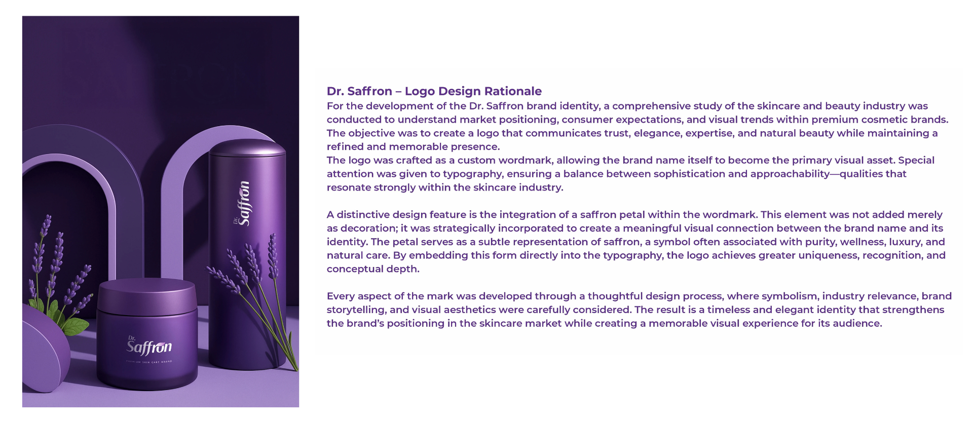
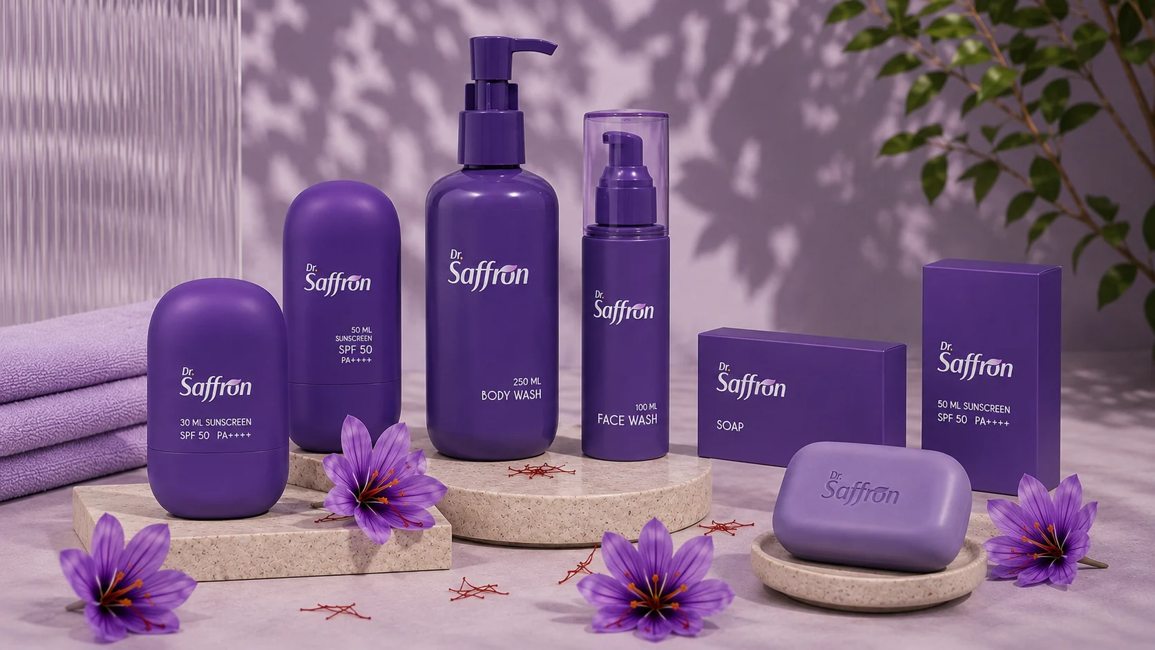
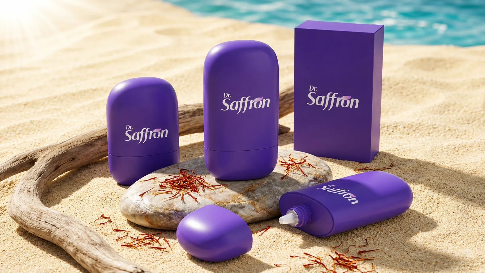
Packaging Application
The identity was designed with scalability and versatility in mind.
The logo performs consistently across:
- Face Wash
- Body Wash
- Sunscreen
- Soap
- Beauty Products
- Premium Gift Sets
- Digital Platforms
The clean typography ensures readability at both large and small sizes while maintaining a premium appearance across all touchpoints.
Brand Outcome
The final identity successfully positions Dr. Saffron as a premium skincare brand that combines elegance, trust, and natural beauty.
By merging refined typography with meaningful symbolism, the logo creates a memorable visual experience that strengthens the brand's market presence and establishes a strong foundation for future product expansion.